

The best movie posters are not necessarily the most aesthetically pleasing, but those that provoke the imagination of the spectator, turning them into storytellers in their own minds as they begin to wonder about the cinematic potential contained within the artwork.
After watching Alien (1979) at a very young age, I remember my parents telling me about the sequel, Aliens (1986), in which Ripley would return to the planet LV-426 with a team of marines. What first caught my attention was the s added to the end of the original title. On the surface, it seems simple, yet its impact is deafening. A single xenomorph aboard the Nostromo was enough to ensure chaos and destruction; the idea of Ripley facing multiple creatures escalated the stakes to a point where survival felt almost unimaginable. The stronger the antagonists, the more compelling it becomes to witness how protagonists overcome them, as their triumph offers reassurance that we, too, might be capable of the same resilience and victory.
Another element that stood out to me was the introduction of a child into the equation. This became even more compelling when we learn that Newt was discovered as an orphan, her family having been killed by the xenomorph, and that she has been hiding from the creatures ever since. The presence of a being that represents innocence and a future within an environment ruled by extermination suggested a story more emotionally profound than that of the original film. Even without visuals, the concept of Aliens alone was enough to ignite my imagination, allowing me to envision the perfect film I wanted to see. But what role does the poster play in provoking that sense of wonder even further?
How it provokes the imagination
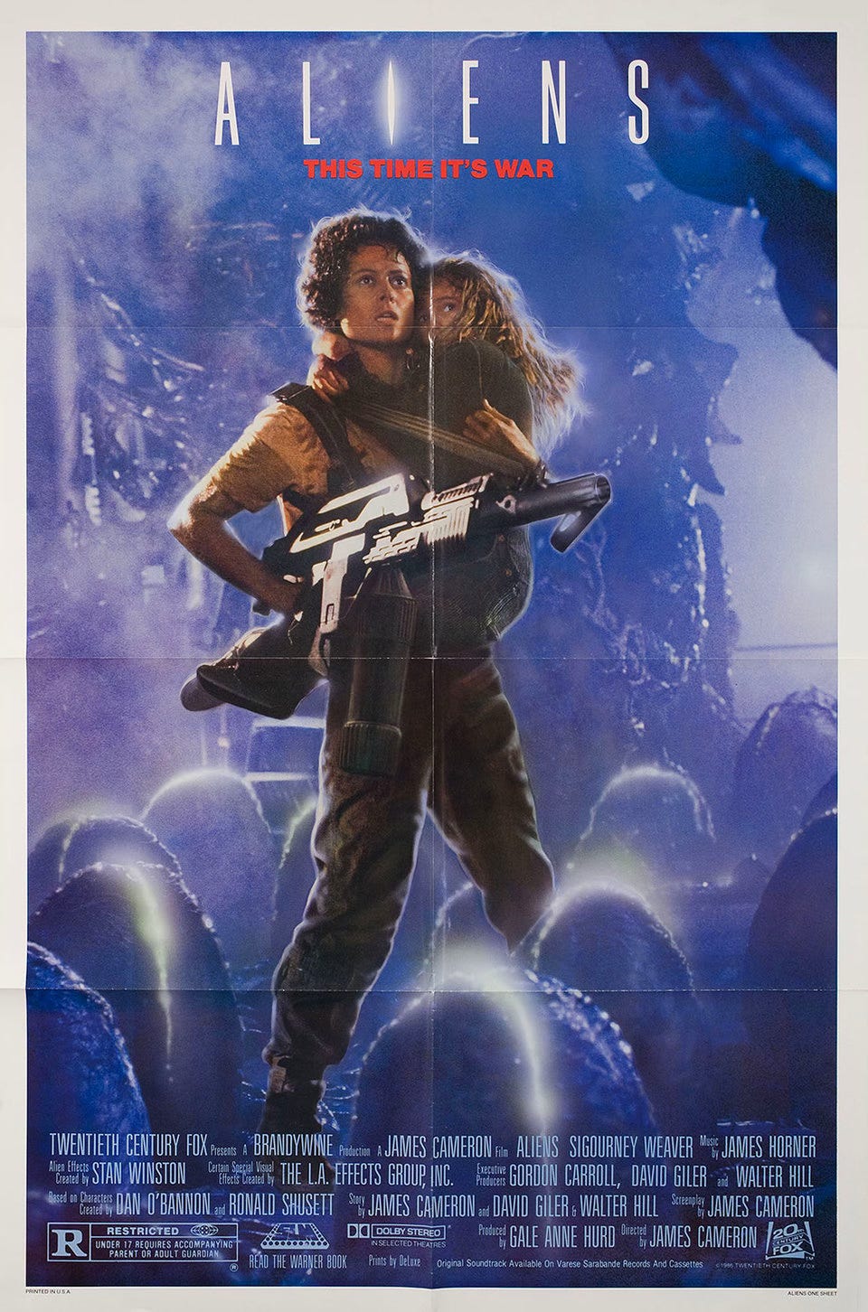
Our first visual reference to Newt reinforces her innocence, as she clings tightly to Ripley, her protector, who is armed with her signature flamethrower while they stare ahead at the threat they face. Although we may trust in Ripley’s strength to defeat the enemy, Newt’s fragility symbolises vulnerability, creating uncertainty over whether both will survive. This tension fuels our curiosity to witness their journey while also encouraging us to speculate on the scale of the threat.
That scale is immediately suggested by the glowing eggs surrounding them, poised to unleash a swarm of facehuggers capable of causing havoc far beyond what was seen in the first film. The magnitude of the danger is further reinforced by the tagline, “THIS TIME IT’S WAR.” While perhaps not as haunting as “In space no one can hear you scream,” it promises a larger, more confrontational conflict that invites the viewer to imagine heightened stakes.
The design of the film’s title also diverges from the bold, modest proportions of the original 1979 poster. The typography here is thinner, taller, and more compressed, creating an impression of claustrophobia. While space remains between each letter, suggesting isolation, this sensation is diminished by the presence of a heavily armed marine unit, reducing the sense of helplessness that defined the original film.
The increased height of the font further implies a greater threat. Although the multiplicity of xenomorphs already conveys this escalation, the bright light piercing through the letter i suggests something concealed behind the artwork. Could there be something else beyond the xenomorphs? The composition reinforces this idea: Ripley’s grounded stance, her weapon aimed outward, and the upward gaze shared by her and Newt imply a threat greater than the eggs surrounding them. Viewers familiar with the film know what this revelation entails, but for those encountering the poster without prior knowledge, it raises the question of whether this danger could have been imagined beforehand. If so, it speaks to the remarkable power of the poster’s design.
So… Is the film as good as the poster?
Aliens can be considered a near-perfect sequel, following a natural progression from its predecessor. The antagonistic forces are amplified, and Ripley returns as the emotional centre of the narrative while facing new challenges as a maternal figure, following the revelation of her daughter’s death on Earth. The film distinguishes itself by shifting genre, moving from pure survival horror to action.
Personally, I felt that this shift weakened the sense of isolation and helplessness that made the original film so compelling. James Cameron’s embrace of the action genre introduced emotional tones that felt somewhat too family-friendly for my taste. Although this did not fully align with my personal taste, taking the sequel in a different direction was ultimately the right decision. By doing so, Cameron ensured that Aliens stands as an individual work, strong enough to exist independently of the original.
The poster mirrors this individuality, provoking an intense sense of wonder by promising a film markedly different from the one audiences had previously encountered. Aliens succeeds in fulfilling the potential suggested by its promotional artwork, delivering on the expectations formed through its graphic design. Considering the ideas sparked by this poster alone, it is difficult to imagine a more effective marriage of concept and execution. As we continue to experience a decline in cinematic storytelling, it raises the question of whether a work as remarkable as Aliens could ever emerge again anytime soon. My guess is not for a very long time.